


Designing a whole web page or sometimes just an input field can be very challenging depending on the approach we take. In today’s development world, and in the frontend in particular, everything can be its own component. Having in mind that everything can be considered a table or container can make your life as a developer a whole lot easier! In this blog we will go over some examples on how we can design about anything with this approach and use flex to style it.
Grid Layout
Everything is a table! When designing a component, a tab or a whole page, a very useful way is to divide them into multiple tables. This provides a flexible structure to your User Interface and ultimately results in a clean experience for the User. In angular, for example, a very easy way to accomplish such a task would be using the angular Fx Layout. Let’s try to build a very simple top bar menu component with drop-downs.
First we need to define the main direction we want to give to our component. In our case, the menu is going left-to-right and we will also have drop-downs that will show under the menu. In such a situation, our direction will be ‘column’, or top-to-bottom using the Angular directive FxLayout.
Example
<div fxLayout="column"></div>
In this main container, every included container will appear top-to-bottom. But the main menu bar we want should be showing left-to-right! To solve this, we can nest tables and give it different directions as we wish.
Example
<div id=’main-container’ fxLayout="column">
<div id=’row-container’ fxLayout="row" >
<div>Option1</div>
<div>Option2</div>
<div>Option3</div>
<div>Option4</div>
<div>Option5</div>
<div>Option6</div>
</div>
</div>

In the above example the nested container ‘row-container’ will have a ‘row’ direction meaning left-to-right, thus everything within this container will appear from left-to-right. Pretty easy for the menu bar that just contains items from left-to-right.
What about the dropdown that will not only go left-to-right for each menu item, but also may contain multiple items going top-to-bottom? For this case we can take advantage of the Angular Grid System.
Continuing to build off of our above example, in the main container we want the second row to be the dropdown and only show upon click. We can think of it like a big table that will be divided in rows and columns then use the appropriate space we want to allocate to any part of it.

Example
 <div id=’main-container’ fxLayout="column">
<div id=’row-container’ fxLayout="row" >
<div>Option1</div>
<div>Option2</div>
</div>
<div id=’dropdown-container’ gdColumns="1fr 1fr 1fr 1fr 1fr 1fr" gdRows="1fr 1fr 2fr">

</div>
</div>
In the ‘dropdown-container’ we defined a set of 6 columns that will all be equal in terms of width and a set of 3 rows where the first and second rows will equally take 1 fraction of the space and the third will take 2 fractions. In this grid, you can position anything anywhere by giving it an axis position coordinate using gdColumn and gdRow.
Example
<div id=’dropdown-container’ gdColumns="1fr 1fr 1fr 1fr 1fr 1fr" gdRows="1fr 1fr 2fr">
<div gdColumn="1" gdRow="1">dropdown1</div>
<div gdColumn="2" gdRow="2">dropdown2</div>
<div gdColumn="3" gdRow="2">dropdown3</div>
<div gdColumn="4" gdRow="1/3">dropdown4</div>
<div gdColumn="5" gdRow="2">dropdown5</div>
<div gdColumn="6" gdRow="1/4">dropdown6</div>

</div>
In this example the first element (container) will take column 1 and row 1 position (*picture-1).
Picture-1

The second element will be located in the second column second row (*picture-2).
Picture-2

The fourth element will be in the fourth column and take row 1 to 3 which in this case will be the first two rows (*picture-3).
Picture-3

The sixth element here will take the last column and all available rows (*picture-4).
Picture-4

With this method, you can pretty much design everything on a page and place elements anywhere you want in a structured and orderly manner. Now you can start with styling it and hiding/showing it appropriately.
Now we’ll take a look at what can be done using Flex-Box.
Flex-Box
As discussed above, Grid Layout has been designed to work alongside other parts of CSS, as part of a complete system for doing the layout. In this section, I will explain how a grid fits together with Flex-Box.
Grid and Flex-Box:
The basic difference between CSS Grid Layout and CSS Flex-Box Layout is that Flex-Box was designed for layout in one dimension – either a row or a column. Grid was designed for two-dimensional layout – rows, and columns at the same time.
One-Dimensional Versus Two-Dimensional Layout:
A simple example can demonstrate the difference between one- and two-dimensional layouts.
In this first example, I am using flexbox to lay out a set of boxes. I have five child items in my container, and I have given the flex properties values so that they can grow and shrink from a flex-basis of 150 pixels.
I have also set the flex-wrap property to wrap, so that if the space in the container becomes too narrow to maintain the flex basis, the items will wrap onto a new row.
<div class="wrapper">
<div>One</div>
<div>Two</div>
<div>Three</div>
<div>Four</div>
<div>Five</div>
</div>

.wrapper {
width: 500px;
display: flex;
flex-wrap: wrap;
}
.wrapper > div {
flex: 1 1 150px;
}

In the image, you can see that two items have wrapped onto a new line. These items are sharing the available space and not lining up underneath the items above. This is because when you wrap flex items each new row (or column when working by column) is an independent flex line in the flex container. Space distribution happens across the flex line.
A common question then is how to make those items line up? This is where you want a two-dimensional layout method: You want to control the alignment by row and column, and this is where grid comes in.
A couple of simple questions to ask yourself when deciding between grid or Flex-Box is:
- do I only need to control the layout by row or column
– use a Flex-Box - do I need to control the layout by row and column
– use a Grid
Content Out or Layout in?
In addition to the one-dimensional versus two-dimensional distinction, there is another way to decide if you should use Flex-Box or grid for a layout. Flex-Box works from the content out. An ideal use case for Flex-Box is when you have a set of items and want to space them out evenly in a container. You let the size of the content decide how much individual space each item takes up. If the items wrap onto a new line, they will work out their spacing based on their size and the available space on that line.
Grid works from the layout in. When you use CSS Grid Layout you create a layout and then you place items into it, or you allow the auto-placement rules to place the items into the grid cells according to that strict grid. It is possible to create tracks that respond to the size of the content, however, they will also change the entire track.
If you are using Flex-Box and find yourself disabling some of the flexibility, you probably need to use CSS Grid Layout. An example would be if you are setting a percentage width on a flex item to make it line up with other items in a row above. In that case, a grid is likely to be a better choice.
Now that we have a better understanding of when to choose grid over Flex-Box or vice versa, let’s dive in deep with what Flex-Box offers us to make our lives easier.
Terminology:
- Main Axis – The main axis of a flex container is the primary axis along which flex items are laid out. Beware, it is not necessarily horizontal; it depends on the flex-direction property (see below).
- Main-Start | Main-End – The flex items are placed within the container starting from main-start and going to main-end.
- Main Size – A flex item’s width or height, whichever is in the main dimension, is the item’s main size. The flex item’s main size property is either the ‘width’ or ‘height’ property, whichever is in the main dimension.
- Cross Axis – The axis perpendicular to the main axis is called the cross axis. Its direction depends on the main axis direction.
- Cross-Start | Cross-End – Flex lines are filled with items and placed into the container starting on the cross-start side of the flex container and going toward the cross-end side.
- Cross Size – The width or height of a flex item, whichever is in the cross dimension, is the item’s cross size. The cross size property is whichever of ‘width’ or ‘height’ that is in the cross dimension.

Flex-Box Properties:
Properties are specific for flex containers and flex items.
Parent Properties:
- Display: It enables a flex context for all its direct children.
- Flex-Direction: This establishes the main-axis, thus defining the direction flex items are placed in the flex container.
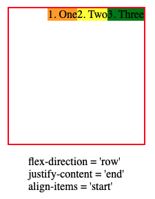
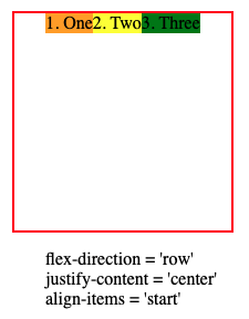
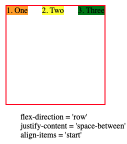
- Justify-Content: This defines the alignment along the main axis.
- Align-Items: This defines the default behavior for how flex items are laid out along the cross axis on the current line.
Code Samples

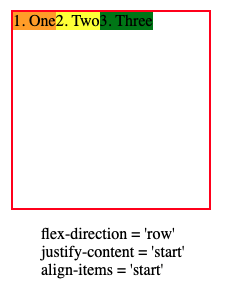
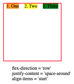
<div class="container" fxLayout="row" fxLayoutAlign="start start">
<div class="child-1">1. One</div>
<div class="child-2">2. Two</div>
<div class="child-3">3. Three</div>
</div>
Let us consider the previous dropdown container example that we covered in the previous Grid Layout section. Dropdown at option6 is a container which has 3 items in it. Let’s look at different layouts.

Children Properties:
- Order: By default, flex items are laid out in the source order. However, the order property controls the order in which they appear in the flex container.
- Flex-Grow: This defines the ability for a flex item to grow if necessary.
- Flex-Shrink: This defines the ability for a flex item to shrink if necessary.
- Flex-Basis: This defines the default size of an element before the remaining space is distributed.
Code Samples
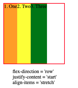
<div class="container" fxLayout="row" fxLayoutAlign="center stretch">
<div class="child-1" style="order: 3;">1. One</div>
<div class="child-2" style="order: 2;">2. Two</div>
<div class="child-3" style="order: 1;">3. Three</div>
</div>

<div class="container" fxLayout="row" fxLayoutAlign="start stretch">
<div class="child-1" fxFlex='auto'>1. One</div>
<div class="child-2" fxFlex=30>2. Two</div>
<div class="child-3" fxFlex=20>3. Three</div>
</div>

The Conclusion
Flexbox and CSS Grid are both great, but neither one is a replacement for the other. They are best used together to create clean, manageable, and flexible web pages. Use the bullets below as a guide for when to use each:
- CSS Grid is best used for two-dimensional layouts, meaning columns and rows.
- Think big picture, and overall layout of the page.
- Flex-Box works best in one-dimension (columns or rows).
- Think of individual content areas, such as a menu or sidebar.
With almost full browser support, CSS Grid will be a necessary skill for front-end developers to learn and master.
Authors: Dimitri Tenke Fokoua, Siva Nammi

Leave a Reply